Case Study: Zara App Redesign
Fashion Over Function
The Zara mobile app is a very stylized shopping experience that evokes a chic, editorial feel by utilizing sleek typefaces and beautiful photography.
Zara is a well-known name in the fashion world, and its app does a good job making the user feel as though they are perusing a fashion magazine. However, when it comes to functionality, there are a few simple design improvements I believe could make a huge difference.
I broke the app into five main functions based on the navigation to analyze and suggest improvements: Homepage, Shop, Favorites, User Page, and Search.
Homepage
Original Design

The landing page is confusing; the primary purpose of the app is to shop, but it is unclear how to begin that process.
This landing page evokes a nice editorial feel, but that should not be prioritized over function; there is a better way to accomplish the branded feel while maintaining ease of use.
Improved Design

My redesign makes it more clear that these photos are related to a sale, which you can click into from this page.
The new navigation bar highlights the primary function of the app, which is shopping.
Shop: Menu
Original Design

This type-only menu lacks hierarchy and appears very overwhelming.
This would be a good place to entice users into shopping a certain category and reinforce the editorial feel.
Not having the primary navigation bar on this page puts the user in a state of confusion about where they are and how to get elsewhere.
Improved Design

My redesign makes it more clear that these photos are related to a sale, which you can click into from this page.
The new navigation bar highlights the primary function of the app, which is shopping.
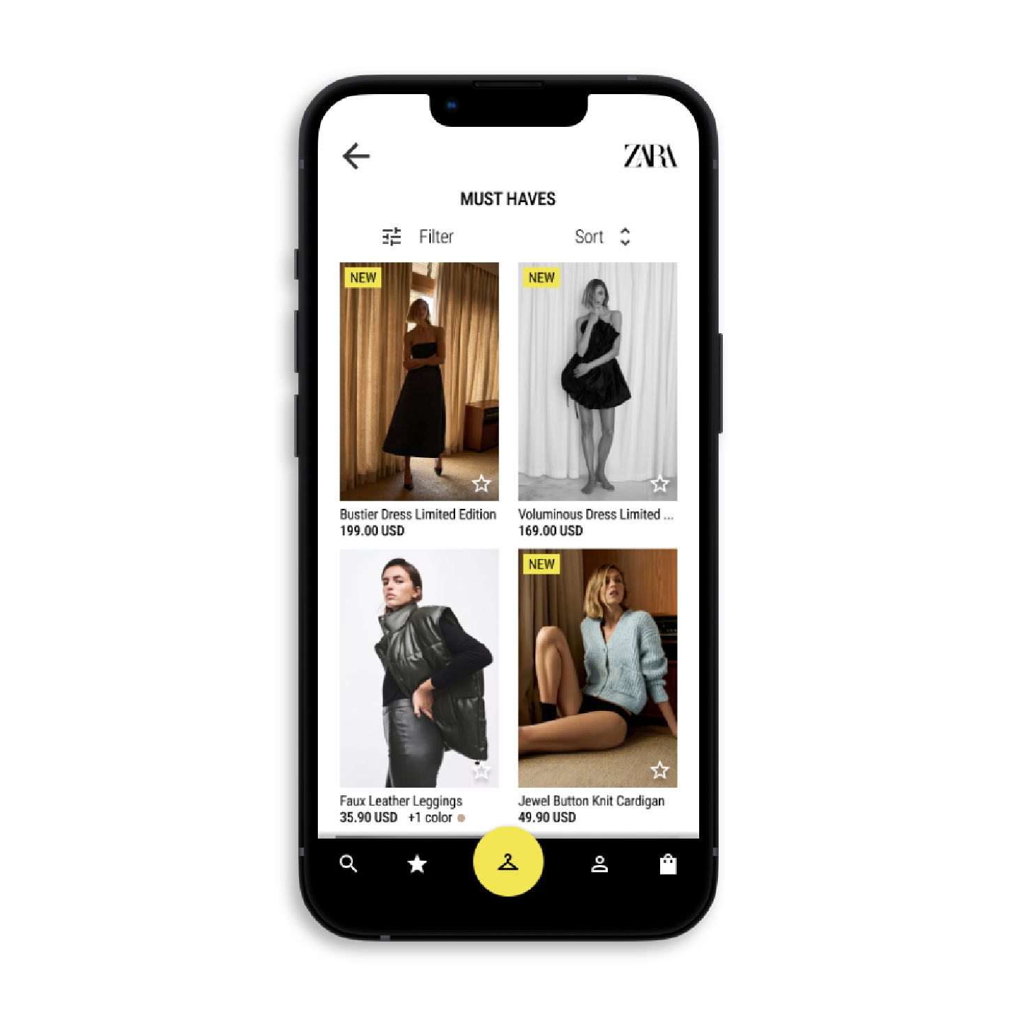
Shop: Browse
Original Design

The size slider at top seems unnecessary; the function is also not immediately clear to user. It takes up too much hierarchical space.
The type hierarchy for each listing could be improved.
Improved Design

Icons make options like filter and sort more apparent. New items are easier to spot at a glance with the tag in the top left corner. Users can add items to their favorites without having to click into the listing.
Additional colors can be previewed and changing the listing title to sentence case improves legibility.
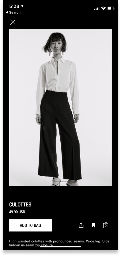
Shop: Listing Page
Original Design
There is a lack of navigation and users cannot quickly see multiple color options for an item.
Improved Design

My design highlights the call to action of “add to bag” and moves it up in the page's visual hierarchy. It is easy to switch between multiple color options and the navigation bar still visible.
Favorites
Original Design

It is unclear that these are items that have been saved or favorited and there is no way to filter or quickly find specific items.
Improved Design

I added a header for clarity, and search, filter, and sort functions for ease of use when looking for a specific item. Users are able to use the star icon in the bottom corner to quickly remove items from favorites.
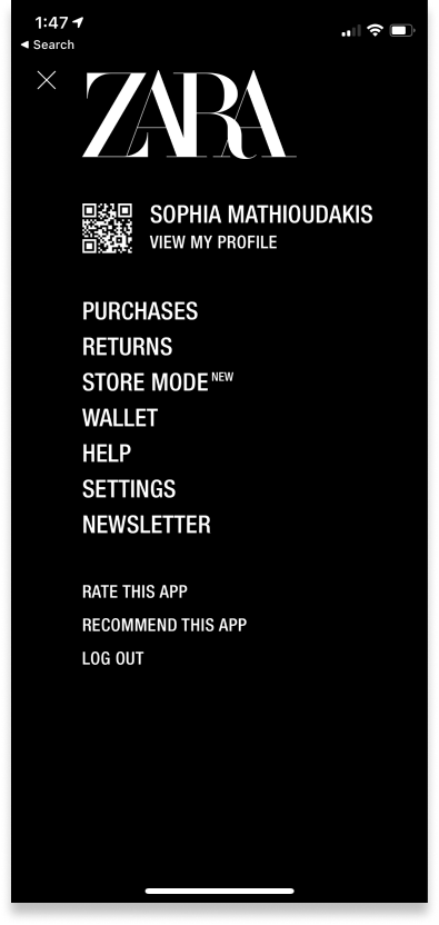
User Page
Original Design
The type-only list is difficult to scan through visually. The function of the QR code (for use at in-store checkout) is unclear; it is also unclear that to open the QR code, it must be tapped.
Improved Design

The QR code function is clearer. Icons clarify each option and allow user to browse them more quickly. Rate and Recommend functions are removed, as these can be sent to users via push notifications while in-app
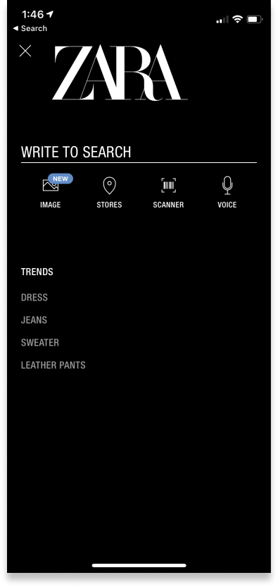
Search
Original Design
The search functions are appealing but the purpose of the trends list is unclear.
Improved Design

Adding photos to trends section entices user to look at them and the search icon clarifies function. I also improved the type hierarchy and added photos to clarify the function of the trends list.
Conclusion
Overall, I think Zara’s app currently prioritizes fashion over function, but also has a very strong visual feel. The improvements I outlined here would maintain that brand success, but allow a smoother user experience.