Terra Vitamin Packaging
Overview
The concept for Terra by NatureMade was a speculative collaboration between myself and three other design students at the University of Cincinnati—Parker Hawk (industrial design), Morgan Lakofka (communication design), and Stephanie Varney (fashion design)—aimed at helping NatureMade products to appeal to a younger, environmentally-conscious consumer base.
Second-place Award Winner: Institute of Packaging Professionals, Student Ameristar 2021
Evaluating Existing Product & Identifying Opportunity
Since 1971, Nature Made has prided itself on making high quality vitamins that can cover a wide variety of lifestyles. Their commitment to the consumer's health has always come first. However, their packaging has some weaknesses.
At first glance of the shelf set, the following weaknesses are apparent:
The current shelf set is made up of an overwhelming amount of yellow, with all the bottles’ caps and labels being the same color.
It is difficult to differentiate between product varieties and types because of the lack of different identifiers
The label and bottle shapes have little variation across all products
The product blends in with competitors’ products
The individual units themselves have a few weaknesses as well:
The branding is unexciting, dated, and clinical
There is an overwhelming amount of text on the front of the package.
The overall brand does not appeal to a younger audience
Persona: Ideal Consumer
After identifying the weaknesses of the product, we decided to identify who the ideal consumer would be by creating a speculative persona—a 21 year old, eco-conscious college student.With this project, we chose to create a concept that would help NatureMade appeal to a younger audience who has specific health goals in mind. This consumer may be a first-time vitamin purchaser and could easily get overwhelmed by the seemingly endless amount of choices in the vitamin aisle. They want to target specific areas of wellness, minimize their carbon footprint, and invest in products that are natural and sustainable. They do not currently associate NatureMade products with their desired outcome, and cannot find a product that is both natural and lifestyle-focused.
Frustrations:
First-time vitamin consumer
Overwhelmed by vitamin aisle
Does not associate NatureMade with her desired lifestyle
Cannot find a product that is both natural and lifestyle-focused
Current Journey Map
Overwhelming amount of choices
Result-focused vitamins don't emphasize ingredients and vice versa
Find a balance between ingredient-focused and result-focused
Opportunity
Pain Point

This is some text inside of a div block.
Feels like taking medicine
Difficult to open lid, difficult to get vitamins out
Create bottle that is easier to open and dispenses single vitamin at once

Consuming vitamin


Task
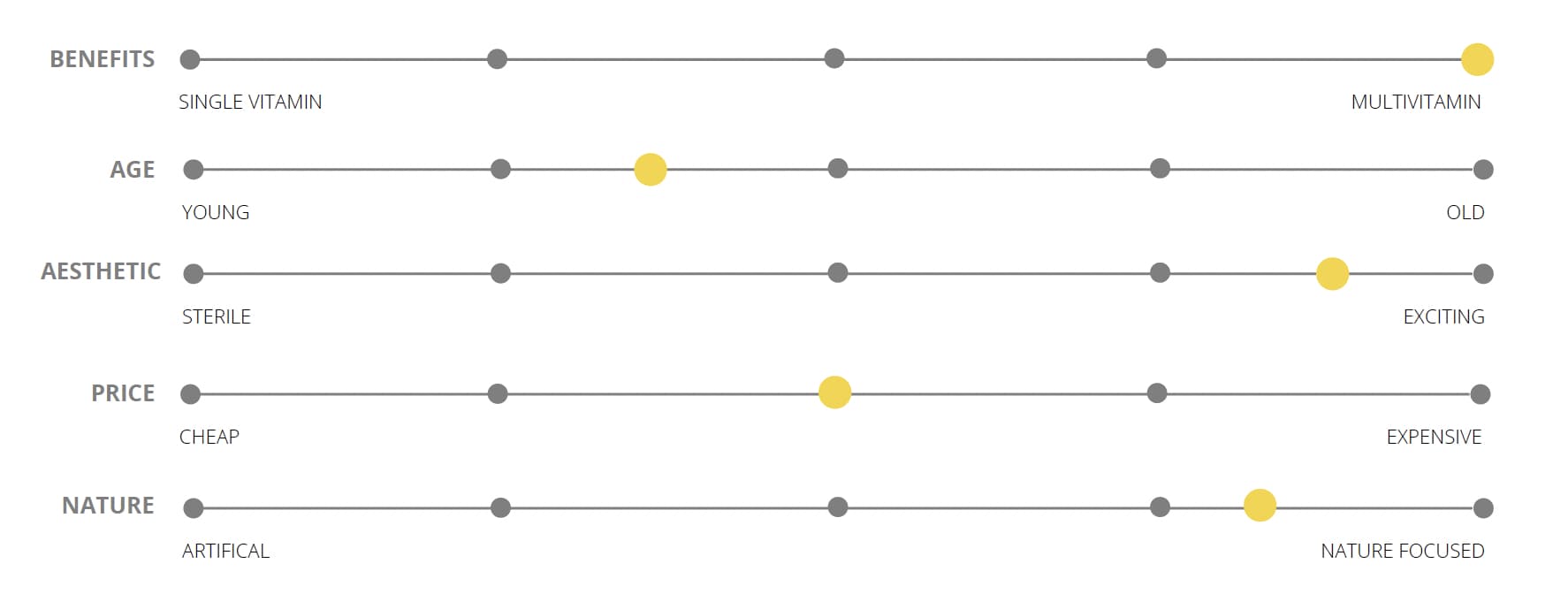
Current Market Analysis

Proposed Market Solution

Problem Statement & Objectives
Problem Statement
The individual supplements within the NatureMade brand of vitamins are difficult to discern between. Shopping for vitamins, especially "natural" vitamins, is an overwhelming experience. A lot of younger people are searching for lifestyle-based supplements, and Nature Made currently does not appeal to this range of users.
Objectives
Packaging made with sustainable use and disposal in mind
Create an intersection between “natural” and “lifestyle” supplements
Redesign a bottle/component that allows for easy dispensing of product
Branding Exploration
As we began to work on branding the speculative product, the other graphic designer and I experimented with muted, natural tones and simple illustrations.
Final Branding

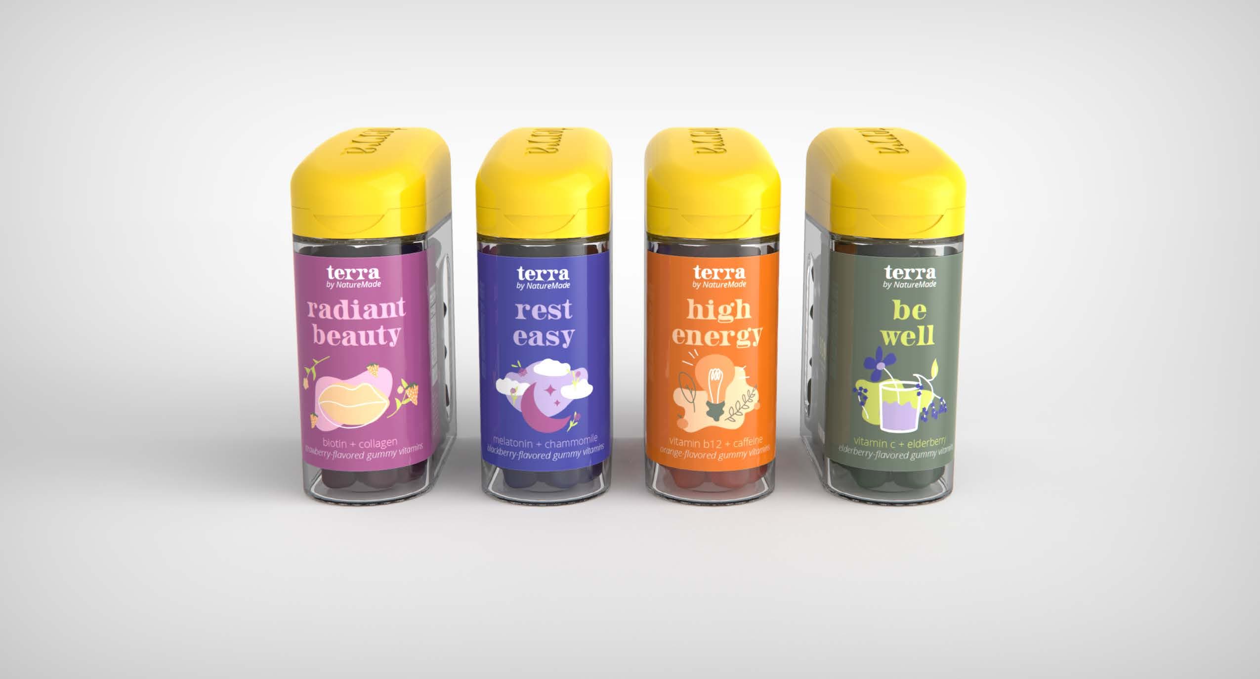
The colors we chose for the final branding needed to be bright enough to work well with the bright yellow of the cap, which we left the same for brand recognition. We incorporated youthful, bright illustrations and sleek typography in order to create a voice for the product which resonated with the desired audience.
Final Product Structure
For the structure of the package, our team decided to keep it recognizable as a NatureMade product by keeping the signature yellow cap, adding an engraved logo on the top for visual interest. Our industrial designer took careful care to create a package that was easy to hold and easy to dispense the product from, by adding indents on the sides of the unit and creating a flip-open dispensing function. Both the lid and the body of the package are made up of Danimer Scientific's PHA, a100% renewable and recyclable bioplastic in order to decrease waste when the package is disposed.


Improved Shelf Presence
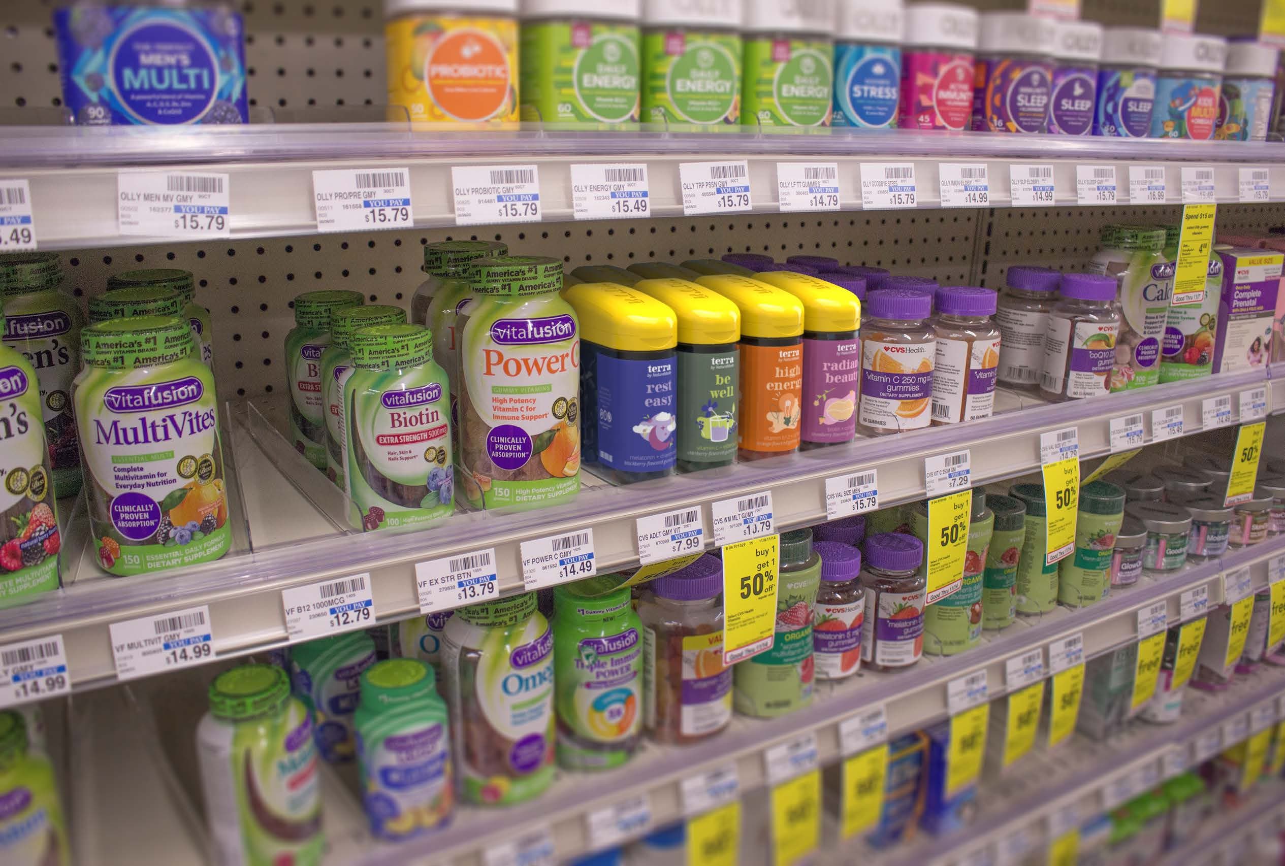
We also wanted to make a point to help improve the presence of the product on the shelf with competitor products. A tall, thin silhouette and the bright yellow cap help Terra to stand out from other multivitamins. The recognizable NatureMade cap provides trust in the product and the trendy brand colors attract a younger audience.
Improved User Journey
Yellow lids and tall, thin form standout among the lifestyle vitamins.
User recognizes the yellow caps as a brand they trust, and knows they are lifestyle-focused.
Point of Difference

This is some text inside of a div block.
It is easy to dispense and consume the correct amount of flavorful gummies.
Flipping open the vitamin cap is simple to do.

Consuming vitamin


Task
Conclusion
This project was a really cool opportunity to work with designers of a different discipline. I also have a personal interest in being environmentally conscious in my own life, so this was a great way to learn about different advances in the packaging industry. I also really enjoyed solving a tangible problem through a lot of research and analysis.


