Accessible Website for Older Adults
Summary
How might we design a trusted community platform that empowers users to quickly find relevant information and take control of their care?
Client
Council on Aging (COA) of Southwestern Ohio
Role
Project Lead / Designer / Researcher
Skills
Usability Testing, UX/UI Design, Project Management
Click here to see the live website →
Background & Objectives
Background
COA’s website serves as the primary access point for older adults, caregivers, and service providers—but users struggled to find information, leading to high call volume.
Goal
Design a more intuitive, accessible website experience that enables users to independently find relevant resources and take action.
My Role
As Project Lead, I:
- Defined research goals and testing strategy
- Co-developed prototypes for evaluation
- Led usability testing sessions
- Synthesized findings into themes and design recommendations
Research Focus
This project centered on understanding how diverse user groups search for, interpret, and act on information in a high-stakes context (healthcare and aging services).
Process
- Exploratory Ideation → Framing Testable Concepts
Rapid Iteration
We began with rapid ideation (Crazy 8s) to explore multiple ways of structuring content and navigation.
Rather than treating this as purely creative, we used it to generate distinct, testable approaches to information hierarchy, navigation patterns, and page layouts.
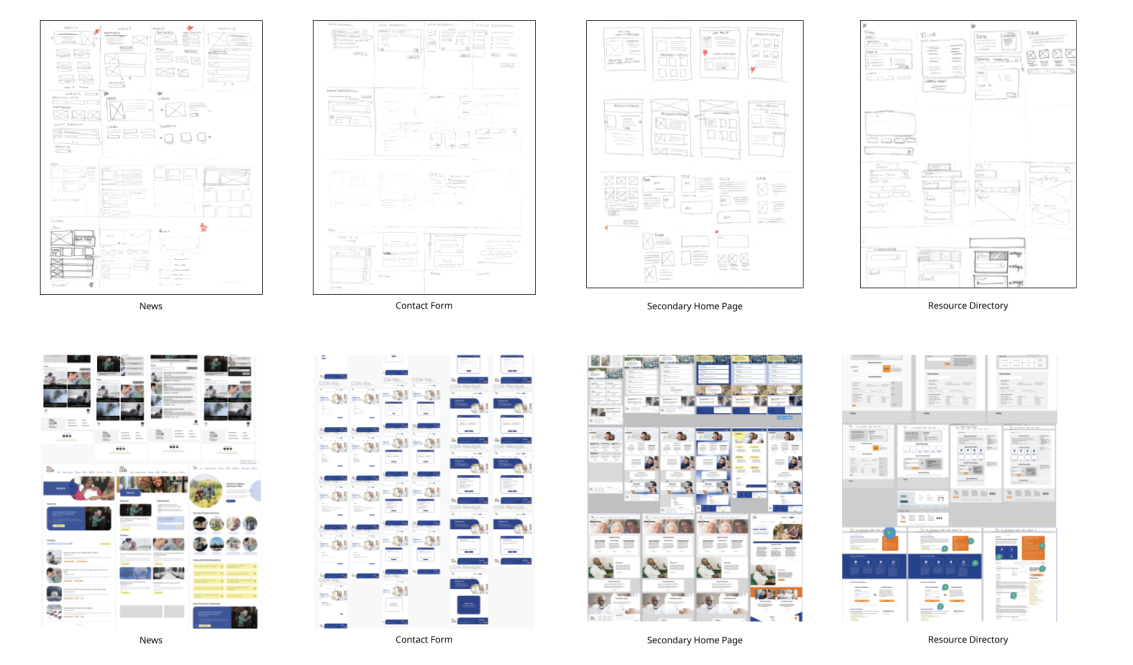
These concepts were translated into wireframes for evaluation.
- Prototype Development → Designing for Research
Initial Prototyping
We translated some of our favorite ideas for each page into a prototype for initial usability testing.
We created an interactive prototype in Figma focused on core user tasks, including:
- Finding services
- Navigating between user pathways
- Understanding available support
The prototype was intentionally scoped to elicit feedback on structure and clarity, not visual polish.
- Usability Testing (2 Iterative Rounds)
User Testing
We tested this initial prototype with older adults, caregivers, and service providers.
Method
- Task-based scenarios to observe real behavior
- Think-aloud protocol to understand decision-making
- Follow-up questions on expectations and mental models
Focused on Capturing:
- Points of hesitation or confusion
- Navigation patterns and misclicks
- Language comprehension
- Users’ confidence in completing tasks
After round one, we refined the prototype and re-tested to validate improvements.
- Synthesis → From Observations to Insights
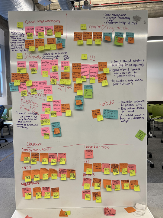
Theme Identification
We clustered observations across sessions to identify patterns, then translated them into actionable insights.
ClarityUsers were overwhelmed by dense or unclear language
HierarchyImportant actions were buried or competing for attention
ProactivityUsers needed guidance on what to do next
ConsistencyInconsistent layouts reduced confidence and learnability
- Design Translation & Validation
We applied these insights to refine navigation structure, content prioritization, and page consistency.
A second round of testing confirmed improved usability and user confidence in completing tasks.
- Handoff
We organized final content and design assets according to the site’s information architecture, enabling a smooth transition to the client team.
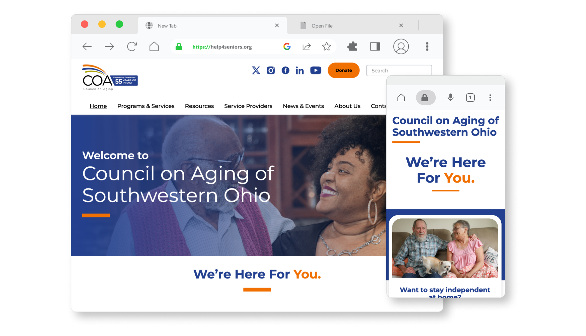
The new COA website launched in 2025.
Click here to see the live website →
Accessible Website for Older Adults
Summary
How might we design a trusted community platform that empowers users to quickly find relevant information and take control of their care?
Client
Council on Aging (COA) of Southwestern Ohio
Role
Project Lead / Designer / Researcher
Skills
Usability Testing, UX/UI Design, Project Management
Click here to see the live website →
Background & Objectives
Background
COA’s website serves as the primary access point for older adults, caregivers, and service providers—but users struggled to find information, leading to high call volume.
Goal
Design a more intuitive, accessible website experience that enables users to independently find relevant resources and take action.
My Role
As Project Lead, I:
- Defined research goals and testing strategy
- Co-developed prototypes for evaluation
- Led usability testing sessions
- Synthesized findings into themes and design recommendations
Research Focus
This project centered on understanding how diverse user groups search for, interpret, and act on information in a high-stakes context (healthcare and aging services).
Process
- Exploratory Ideation → Framing Testable Concepts
Rapid Iteration
We began with rapid ideation (Crazy 8s) to explore multiple ways of structuring content and navigation.
Rather than treating this as purely creative, we used it to generate distinct, testable approaches to information hierarchy, navigation patterns, and page layouts.
These concepts were translated into wireframes for evaluation.
- Prototype Development → Designing for Research
Initial Prototyping
We translated some of our favorite ideas for each page into a prototype for initial usability testing.
We created an interactive prototype in Figma focused on core user tasks, including:
- Finding services
- Navigating between user pathways
- Understanding available support
The prototype was intentionally scoped to elicit feedback on structure and clarity, not visual polish.
- Usability Testing (2 Iterative Rounds)
User Testing
We tested this initial prototype with older adults, caregivers, and service providers.
Method
- Task-based scenarios to observe real behavior
- Think-aloud protocol to understand decision-making
- Follow-up questions on expectations and mental models
Focused on Capturing:
- Points of hesitation or confusion
- Navigation patterns and misclicks
- Language comprehension
- Users’ confidence in completing tasks
After round one, we refined the prototype and re-tested to validate improvements.
- Synthesis → From Observations to Insights
Theme Identification
We clustered observations across sessions to identify patterns, then translated them into actionable insights.
ClarityUsers were overwhelmed by dense or unclear language
HierarchyImportant actions were buried or competing for attention
ProactivityUsers needed guidance on what to do next
ConsistencyInconsistent layouts reduced confidence and learnability
- Design Translation & Validation
We applied these insights to refine navigation structure, content prioritization, and page consistency.
A second round of testing confirmed improved usability and user confidence in completing tasks.
- Handoff
We organized final content and design assets according to the site’s information architecture, enabling a smooth transition to the client team.
The new COA website launched in 2025.
Click here to see the live website →